Beautiful Paint Colors That Are Perfect For Your Kitchen Island
Your kitchen island is often the centerpiece of the room, and not just because it is usually in the literal center of the kitchen. It is the place you go to most often to chop vegetables or eat an informal meal. It's also physically massive, taking up a lot of room, so don't miss out on the opportunity to make it a focal point of your design. Most people's first impulse would be to paint it in the same finish as your surrounding cabinets, which will still look good, but two-toned kitchen cabinets are still a popular option as well.
One of the great design pitfalls is making things overly matching. While you might think this will create a sense of cohesion, it actually makes the room feel flat. Playing with the color of your kitchen island provides the opportunity for more dimension within your space and an expanded color palette, which will bring more personality into your kitchen. When considering the color of your island don't just pick a paint because you like it; consider how it will play with the rest of the room. The different finishes, wall color, rugs, essentially everything in the kitchen, will impact how the kitchen island color works in the room. So take a look at your current design, think outside the box, and be inspired by these 10 beautiful paint colors that are absolutely perfect for your kitchen island.
Use black to complement an all white kitchen
Black paint intimidates a lot of people, and we get it! You dream of a bright, spacious atmosphere, so opening a can of paint resembling a black hole feels discouraging enough to consider returning to the hardware store, receipt in hand. But there is a way to use black paint and make it feel classy and cozy, even on such a large space like a kitchen island. A dark color like black will make the room feel more dramatic, more romantic. If paired with a marble countertop or floors it can provide a striking contrast to an all white kitchen. This style was popular for years, but House Beautiful notes that having a white kitchen could decrease the value of your home. If you don't want to give up your sleek white space or go through the hassle of a full renovation, making the bold choice to add a black accent will ground the room and give it some flair.
While black might seem like a one-size-fits-all color, there are countless options for a suitable dark tone. You can choose one with more purple or blue undertones or decide on a lighter black that toes the line with gray. But if you want to go with an option you know will look good, check out Sherwin Williams SW 6258 Tricorn Black. This is a true black which means it will work with any undertones and fit well into your existing color scheme. Pairing black with white is a classic option, but this shade can truly work with many kitchens if you're not afraid to go a little darker.
Gray is a classic, but avoid going monochrome
For being a neutral color, gray sure is controversial. Some people love it, some hate it, but Joanna Gaines is still a great supporter of gray color schemes. Everyone's favorite modern farmhouse queen frequently uses the hue in her "Fixer Upper" remodels and it is all over the designs for her company, Magnolia. Gray and white is one of her most popular kitchen color pairings to keep the neutral feeling without falling into the all white kitchen trap. In a statement to House Beautiful, Magnolia's senior designer Kristen Bufton said, "You can interchange these colors easily since they are both neutrals, although I would recommend avoiding a monochromatic scheme of all gray." She encourages people to play with fun hardware, rugs, and lighting to add texture to the space.
If you want to fully commit to the Magnolia vibe, you can buy a gray paint directly from Magnolia's collection. Duke Gray has beautiful pale blue undertones that result in a gray that is anything but boring. This will go well if you have other cool tones in your kitchen, but can also provide a nice balance to warmer wood accents. Just make sure to pay attention to what finish you are choosing, since gray tones often look better in a matte finish to help soften them and avoid an industrial feeling.
Evoke nature with a rich green
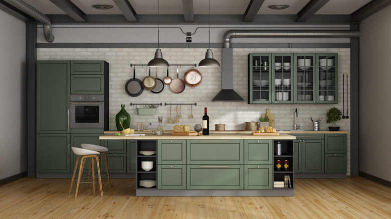
The green kitchen trend is here to stay, but it's hard to call such a versatile color a trend. According to WebMD, it was even popular back in the 1800s despite containing arsenic which made many people fall sick or even die. Green is a very natural color that can create an appetizing kitchen atmosphere and provide a subtle pop of color without going too bold. Depending on the shade of green you choose it can play well with warm or cool tones. A soft sage will create an English country home feeling while a seafoam green will play well in a kitchen of a beach home.
Farrow & Ball have some incredible green shades, but No. W55 Duck Green is a unique stand out. This is a smart, deep green that will draw the eye without overpowering the room. Depending on how much natural light your kitchen gets it can either look more vibrant or muted.
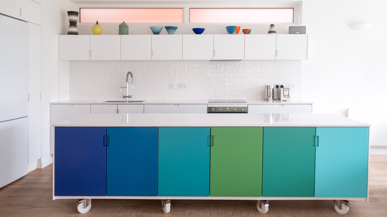
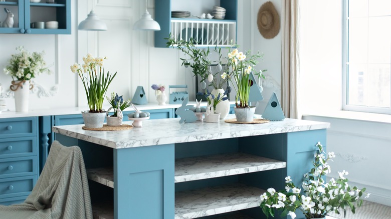
A bold blue will give a pop of color
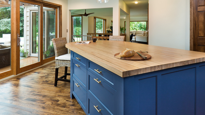
Using blue paint for a kitchen is popular, but it's easy to choose a safe dusty blue or true navy. Instead, consider picking a more vibrant shade that will have a big payoff. Using a bolder blue will still evoke that crisp and clean feeling but it will add a little more oomph than a subtle blue would. There is a fear that using a bold color like this will overpower the room, making it feel stuffy and anxious. But because you are only painting one element, the kitchen island, as opposed to the entire floor to ceiling cabinetry, you can afford to go with a heavier color.
If you want to go full neon blue that's great, but for a bold yet balanced approach try Benjamin Moore's 2059-10 Marine Blue. This shade provides just enough vibrancy for it to truly pop without being so bright it will overpower the space. It will still play nicely with your cabinet colors and when paired with white the maritime feeling will be enhanced.
Vibrant red can work if surrounded by the right materials
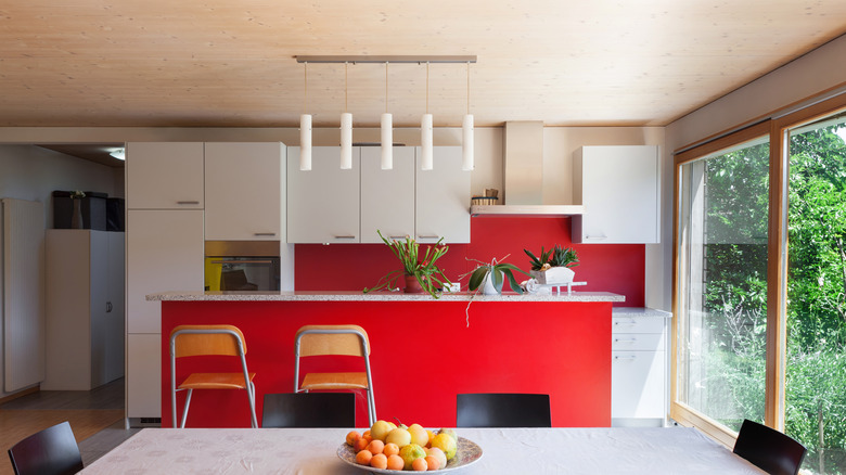
You might be tempted to scroll past thinking red isn't for me, but hear us out. Yes, this color is vibrant, but when paired with natural surrounding materials like wood cabinets or a stone countertop it can create a balanced look. Red will bring tons of energy into any space, and if your kitchen is the place for gathering in your house it can set the right tone.
If you don't want your island to feel like a firetruck, consider Benjamin Moore's 2003-10 Million Dollar Red. Just as the name suggests, this color is rich and luxurious. It is still vibrant and playful, so you get the bold effect you're looking for, but it won't overshadow the rest of your kitchen. Especially in the morning light there is a softness to it which will help make your kitchen feel like home. Just like how throwing a little chili into your dish can add the perfect amount of spice, a fiery red will make your home unique and classy.
Create the cottagecore aesthetic with yellow
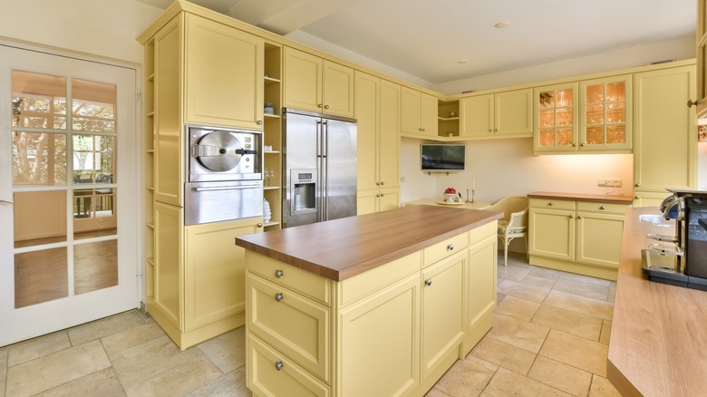
Cottagecore is a nostalgic aesthetic celebrating a simple rural lifestyle, emphasizing nature and a cozy atmosphere. No matter where you live you can incorporate this cheerful feeling into your home by using yellow, one of the staple colors of cottagecore. It feels like sunshine, bees, and wildflowers all wrapped up into one shade. If you have a farmhouse style home this is the perfect choice for you, but it can be incorporated into any style kitchen. You can go for a pale yellow to add some color without distracting from the rest of the room or you can go for a rich mustard to create a bohemian feeling.
According to the Jane Austen Centre, yellow was a particularly popular color in the Regency era. No one does historical colors better than Farrow & Ball. No. 233 Dayroom Yellow is a color inspired by the light-flooded dayrooms of the Regency era. The color is pale yet still very pigmented so you have a lot of color payoff without the need to choose an overly vibrant hue. So if you want to sit at your kitchen island and read a Jane Austen novel, this is the paint for you.
Brown doesn't have to be boring if you create contrast
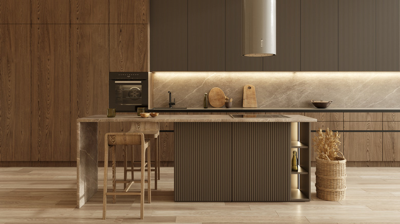
The dreaded brown kitchen might evoke a flashback to the '70s, but there is a way to use brown without it being boring and dull. Painting your island a darker shade of brown can break up the space and make it feel more dynamic. Brown is also a good choice if you have colorful cabinets and want to go more neutral with the island but don't want to use white or gray. Don't be afraid to pair a brown island with wooden cabinets either.
If you have light wood cabinets, complement them with a darker brown like Farrow & Ball's No. 9918 Cola. This is a chocolatey brown that evokes a warm, intimate feeling because of its red undertones. These undertones prevent it from feeling too dated or industrial. This also means that it will play well with pink-based shades if you want to create a feminine kitchen, as well as complement rich shades of blue for a balance of warm and cool.
Light blue can be a timeless yet colorful option
If you want to integrate some color without committing to a full-on rainbow kitchen, a light blue is your best bet. Evoking a cloudless sky on a sunny day, a light blue will bring some cheerfulness into your kitchen without weighing things down. Especially if you have a large or bulky island, you might want to pick a lighter color and save the dark accents for things like stools, the countertop, or other cabinets. A light blue will also pair well with white, creating a soft and calm kitchen atmosphere. Teak is a great wood for kitchens which pairs well with light blue. Together they create a beachy feeling, perfect for a house by the shore or one inspired by nature.
Benjamin Moore's BM1668 Blue Stream is a muted and powdery blue that will fit into many different spaces. It's not an overly reflective paint which helps contribute to its subtlety as well. An option like this is perfect for those who want to dip their toe into a more colorful home but don't want the commitment of changing their wall color.
Pink can be classy and elegant if done right
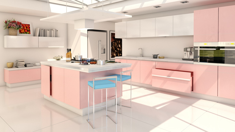
If you want a kitchen that Barbie would be proud of, look no further than a pink kitchen island. But don't worry, your dream home won't turn into something that looks childish and cheap. If you use a soft pink with the right level of richness it can look classy and elegant. Think flower-inspired, English countryside pink rather than bubblegum hot pink. Integrating hints of pink pulls in the feeling of spring, perfect for a farmhouse or cottagecore style home. While feminine, it can also be balanced with metal accents and darker surrounding elements to keep things feeling modern.
Farrow & Ball's No. 295 Sulking Room Pink is a prime example of a subtle, elegant pink. It's muted and delicate, pairing equally well with creamy whites and dramatic blacks. Pairing a rosy pink with brass or gold hardware will complement nicely, allowing the hardware to really pop against the color.
If all else fails, cream will always look good
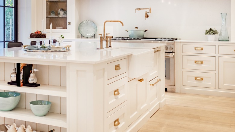
No matter the style of your house, the size of your kitchen, or the surrounding colors, painting your kitchen island cream will almost always result in a clean, cohesive look. Cream paint is just white with a little yellow mixed in to soften things up, which helps the space feel more cozy. The dash of warmth helps it pair well with almost all colors from a deep navy to a vibrant red. For this reason it's a good option if you are someone who likes to change around your decor often. If a new pair of patterned bar stools catches your eye you don't have to worry about whether they will clash.
Sherwin Williams SW 7012 Creamy is a go-to shade for a reason. It's subtly warm without appearing too yellow. While you might think cream and white are too similar to complement one another, Joanna Gaines (via House Beautiful) says that the two shades actually play well together while still being interchangeable. So if you want to keep that clean kitchen feeling without having a fully white kitchen, integrating a splash of cream to your island will balance out the room while still feeling fresh.