14 Color Combinations That Will Transform Your Home's Interior
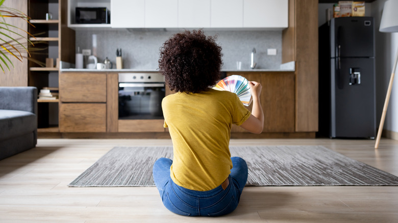
According to the American Academy of Ophthalmology, the human eye can perceive around 10 million colors. With so much nuance, it can be tricky to pick out the perfect color palette for your home. If you've ever tried to find the ideal white paint for your walls, you know how complex color can be, and how much of an impact it can have on your home. It can add dimension and energy, trick the eye, and trigger emotions. Because color plays such a powerful role, it can be daunting to decorate with. How can you implement something fresh and vibrant while avoiding clashing chromas and sensory overload? The secret lies in picking the right palette.
Certain color combinations are inherently attractive. Once you know what these are, it's like having a cheat sheet that will help you incorporate color into your space in a way that's classy, cool, and current. Whether color is your kryptonite, or something you love and are eagerly looking to use more of — you're in the right place. Buckle up, because you're about to uncover 14 color combos that will seriously level up your decorating game.
Achieve a beautiful balance with blue-black and mint-green
If you like contrast but want to create a cohesive color palette that's a little more quirky than black and white, you'll love this interesting pairing. Mint green has been trending on the runway, and any fashion/design addict will tell you that what happens on the catwalk soon overflows into interiors. Mint green is both refreshing and soft. Pairing it with a very dark blue that almost borders on black will add strength and contrast. The blue tone will also pick up on the coolness of the mint green. It's not as harsh as black and won't channel any mint chocolate chip associations. If you want to throw a third color into the mix, white will accentuate the crispness, while sand tones can bring a softer, more grounded, and dreamy feel. If you have light, natural wood in your space, it can be the perfect beige for this palette.
Wondering how exactly to execute this color combination? If you're drawn to mint green, make this your main color by using it on your walls, cabinets, or closet fronts. Use beige or white as your secondary color, channeling it through your ceiling, a rug, flooring, or large furniture items. Then, make the look pop by adding in some blue-black accents. This could take the form of décor items, upholstered furniture, art, etc. Or, you can make a bold move and paint your trim and baseboards a dark, saturated blue.
Channel maturity with black, white, terracotta, and tan
If you are drawn to neutrals but don't want a flat feel to your home, this color combo could be for you. Beige, black, and white is a great base that's easy to build. It's effortless to mix and match, nothing will clash, and there is still enough contrast to keep the eye moving. But adding terracotta to this palette takes it to a whole new level. Red tones combined with black can create a lot of visual energy. Terracotta offers a more toned-down alternative to bright reds. While it still injects warmth and richness, it's muted enough to be easy on the eye.
Besides being simple to implement, this color combo is also very flexible. None of these colors are super overwhelming, so you can match them up in just about any ratio. If you want a very soft, calming space, you can use white and beige as your primary colors and then add in accents of black and terracotta. Or, you can go the opposite route and go hard on the darker tones. This will make the overall feel more intense, bold, and dramatic. Because this color palette involves four players, try to echo each one a couple of times. For instance, if you were to have a terracotta sofa and nothing else with red tones in the room, this could look disjointed. Adding in even a couple of clay-colored items will create visual continuity.
Energize forest green with some fiery orange
After gathering metaphorical dust for almost two decades, green has officially re-entered the zeitgeist. This is part of a wide return to '90s trends, both in style and design. While the fashion-forward don hip hop-inspired baggy silhouettes, interiors addicts are washing rooms in moody green hues, painting verdant accent walls, and decking out wet rooms in viridian tile work. If you want a piece of the emerald-toned action, you'll be pleased to know that green is a highly versatile color. Even though it fell off the trend charts for a while, it has a relatively evergreen (pardon the pun) nature. Medium and muted tones are especially timeless. They are inherently calming and can suit a variety of design styles, from current and contemporary to ultra-classic. Because forest green shades are so soothing, you might find they lack some visual energy when paired with muted or analogous colors. If you want to pump up the vibes a bit, orange is the answer. Orange sits almost opposite on the color wheel. It contrasts beautifully with green while being a little more lighthearted than red.
If an orange-and-green color combo sounds intense, remember that you don't need to have big swathes of each color. For instance, if you have a forest green accent wall, you can punctuate it with small pops of orange accents. A couple of apricot candlesticks, a tangerine-colored book, or a cushion cover in papaya can add visual energy without overwhelming the space in color.
Show off your sophisticated side with forest green, brass, brown, and beige
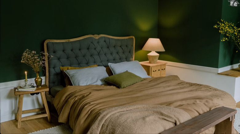
Do you love forest green for the serene feels it gives off, and are not interested in pepping up your palette with fiery tones? If so, consider taking a more classic, toned-down approach by pairing it with brown, beige, and brass accents. The most perfect, seamless color palettes are almost always the ones found in nature. This might sound basic, but brown will work with forest green until the end of time because, well, trees. Can you think of a tree that didn't look good sporting verdant leaves and brown bark? The two colors are intrinsically tailor-made for each other. But dark brown and forest green on their own can feel a little heavy, so adding in some beige will help to make the palette pop. And for the final elegant accent on top, brass will bring a muted warmth that will perfectly offset any excess chilliness from the green.
This color combination is inherently moody, especially if you choose green and brown as your main hues. However, you can also do a lighter take by using more beige and adding dark browns as accents rather than a primary player in the palette. Forest green color schemes can also fit an array of design styles. Thanks to its current popularity, going for a muted, dark green will make your space look up-to-date, but it can also pair perfectly with traditional and transitional design styles. The Historic Colors of America paint color list includes various shades of dark green, which is one of the reasons forest green has a heritage feel to it.
Get current by layering tons of cream, caramel, off-whites, and beiges
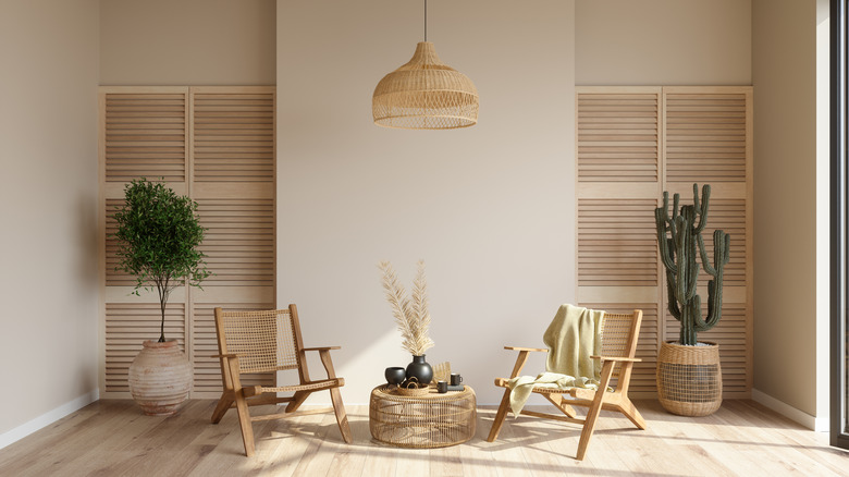
After being relegated to a not-trendy status while gray tones graced walls, floors, and furniture, beige is back with a bang. Color palettes are being washed in warm tones as creams, kakis, and off-whites flow steadily back into our homes. If you — like much of the design world — are making a hard 180 turn on the 50 shades of gray era, and you love a layered neutral look, this calming color palette could be the way to go. It's relatively simple to execute, very easy on the senses, and you don't have to worry about matching shades too closely. The secret to a successful beige-on-beige-on-beige color scheme is to create dimension and subtle contrast between different warm neutral tones. What you don't want is to have only a couple of shades, as this can feel flat. Instead, look for lots of slight variations in color. Just like bolder hues, neutrals have undertones. Playing with these and pairing them in unexpected ways can introduce that tiny amount of tension, which will energize your color palette.
Texture is the other big-ticket item to pay attention to. Visual texture is the unsung hero of mostly monochromatic spaces. Without it, there's nothing to excite the eye and differentiate elements in the space. But as soon as you start introducing an array of textures and finishes, suddenly the room will come alive. A stone plinth or glass tabletop can help cool down the cozy finish of a bouclé sofa. A shaggy sheepskin rug can offset the smooth feel of hardwood or tile floors. Varying paint finishes is another way you can introduce more texture. For instance, you can opt for a matte beige paint on your walls and a glossy finish on your baseboards or ceiling.
Cheer up a space by playing with pink and green
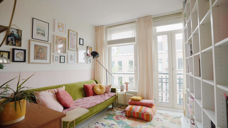
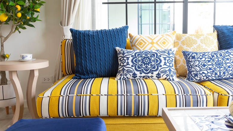
If you want to channel your fun-loving, youthful side, pink is your pal, and green is that sidekick that never fails to come through. Pink and green make for an ultra-pleasing color combo because they land smack opposite each other on the color wheel. That old saying "opposites attract" definitely holds true when it comes to color. Whether you're starting with a pink-heavy palette, lots of green, or just want to add the two hues as accents -– you're guaranteed to get a feel-good vibe going. Pink and green make each other pop. Pink alleviates the coolness of green, and green helps to cut through all the warmth. They also look great when paired with colors that sit square to them on the color wheel, such as shades of yellow or its analogous sibling orange. Blue is also a great bet, and together, these four hues can create a vibrant, dynamic mix, perfect for the color-hungry maximalists among us.
If decking out your domain in pink and green sounds like too much of a sensory party, and you're worried it will be over the top, remember that there are lots of directions you can take this combo. Yes, you can wave your color-loving flag high and go bright with options like hot pink and lime green. But you can also keep things (literally) toned down by opting for muted shades, such as olive and blush. You can even leverage the combo with "non-colors" like warm white that has a slight peach undertone and taupe shades that have a green tint.
Inject optimism with soft orange, purple, and pops of yellow
Color can dramatically change the energy of an interior, and orange, yellow, and purple are the way to go if you want a popping palette. According to a 2020 paper published in the Association of Psychological Science, both yellow and orange are usually associated with joy. Some people associate purple with pleasure, but it can also have other meanings, including luxury, wisdom, and wealth. When paired with yellow and orange, purple acts to temper the warmth of these two bright colors, adding balance to the palette.
On the surface, this might sound like a very maximalist combination, but it doesn't have to be. If you're in need of a serious dose of color, you can pump up the intensity of the tones and use lots of them. A buttercup-colored sofa against a wall painted in peach with a couple of purple throw pillows is definitely going to make a bold statement. But if you want something a little less brazen, you can turn to softer, subtler, more muted shades. Instead of using tangerine orange, go for terracotta, and then add in small touches of yellow and purple. Speaking of tiny touches, another approach is to accent an ultra-neutral space with saturated, bright versions of these colors. Think of an almost all-white room, decked out with just a couple of bold items to make the space speak.
Combine coral and aqua tones to create an upbeat energy
Another color combo that's guaranteed to turn heads is coral and aqua. Pink and blue are pretty much bound to look good together, no matter what shades you select, but the brighter and bolder you go in tone, the more attention and contrast you can create. Coral pink isn't as retina-searing as hot pink or fuchsia, but it's bold enough to stand up to the unapologetic brightness of aqua. The result is an upbeat, charming team-up that will add a youthful energy to your space.
Of course, no color scheme is an island, so you might be wondering how to integrate this cheerful pairing into an area that already has other colors in it. Light wood or white-washed floors will feel seamless in keeping with this palette. White walls can create the perfect crisp, neutral backdrop to give the eye a rest from all the color. Gray is another good choice, provided you pick a hue that harmonizes with the shade of aqua you've chosen. You can also choose a gray that has pink undertones.
Bring together dusty blue and beige for a soft, calming look
Did you know that blue is the most popular color across the planet? If you, too, love blue, and are looking to create a tranquil, peaceful zone in your home, consider pairing powder blue with beige. Dusty, gray-toned shades of blue are soft on the senses and perfect if you want to channel a Parisian aesthetic. While white pairs well with pale blue, beige is a great alternative that can add some subtle warmth to balance out the cool undercurrent. From here, all you need is some gold hardware, and you're all set to create a dreamy space with a light touch of luxe.
This simple palette isn't only easy on the eye; it can also work well with a variety of other neutrals and wood tones. For instance, it can help brighten up dark wood floors or trim. If you have a yellow-tinged hardwood floor, dusty blue will freshen up those warm wood tones. If you have any light gray elements in your space, like a sofa or accent chair, they should be able to blend well, as dusty, powdery blues are muted, which means they have gray undertones. While gold hardware will sparkle and pop against a pale blue backdrop, stainless steel hardware won't look out of place either. If you have stainless steel appliances, furniture, or lighting fittings, they should subtly sync with this color scheme.
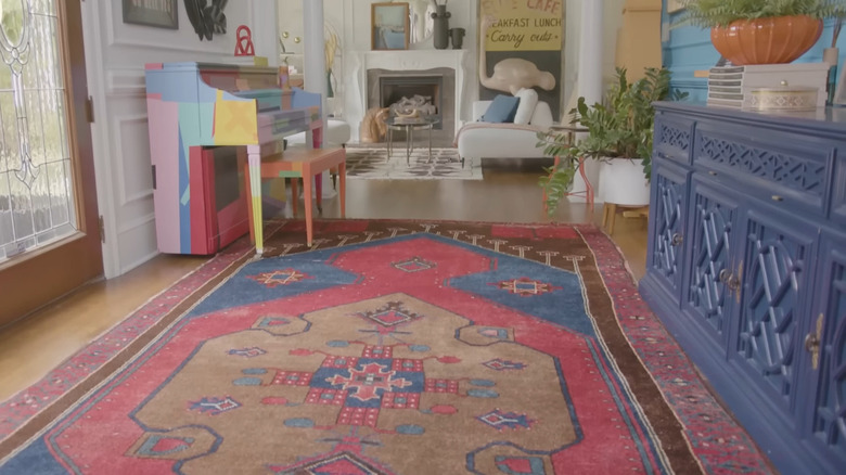
Dare to be different by marrying lavender, green, yellow, and warm reds
If you're after an eclectic look that's daring and different, and has a lot of energy, look no further. Lavender, green, yellow, and warm reds all paired up together might sound like a chaotic riot of chromas, but it's actually underpinned by some solid color theory. This look combines the power of not one but two sets of contrasting colors. If you examine a color wheel, you'll see that purple and yellow are right across from each other. So are red and blue. Because of this, they feel like they inherently belong together, while creating lots of visual dynamism.
Double doses of contrasting colors can be ideal if you want to create a really exuberant, maximalist space that pulses with energy. But what if you also crave a sense of calmness or get visually overloaded by too many hues? If so, all you have to do is downsize the dose of each color. You can have a relatively toned-down space with neutral finishes but still introduce statement, color-laden elements, such as a bold rug or piece of art. From here, you can tie it into the room by pulling the most calming colors and incorporating them into other items. For instance, if you have a rug that contains forest green, purple, canary yellow, and red, you can channel the muted green tones into two chairs to achieve a mature look.
Command the eye with a combo of black and red
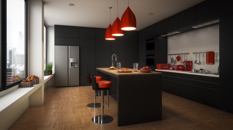
Want to create a space that's unapologetically striking? Black is bold, rich, strong, and stylish. Red is an equally impactful color. It's hot, eye-catching and exciting, and has psychological ties with love and passion. If you combine these two powerhouse hues, you're left with lots of tension, drama, and attitude. Depending on how you incorporate these colors, this pairing can feel modern, luxurious, urban, polished, or even a little rebellious.
Because red and black have such strong personalities, you'll want to carefully consider how much of each to include in a space. Black is a neutral; therefore, you can get away with bigger areas before it becomes overstimulating. Red (especially primary hues) can be a lot for the eye in large doses. For instance, a black sofa is less taxing to the eyes than a bright red one, and a room painted all in black will be less overwhelming than one decked out entirely in red.
If you're keen to create a moody space, feel free to incorporate a lot of black, either in paint or furnishings, and finish off the space with a few eye-catching red items, like cherries on the top. Alternatively, you can create a light, very neutral space with a blend of black and white elements and a couple of pops of red. If you want more red in the space, consider going with more muted tones, such as terracotta or burgundy.
Make a black and white color palette pop with buttercup yellow
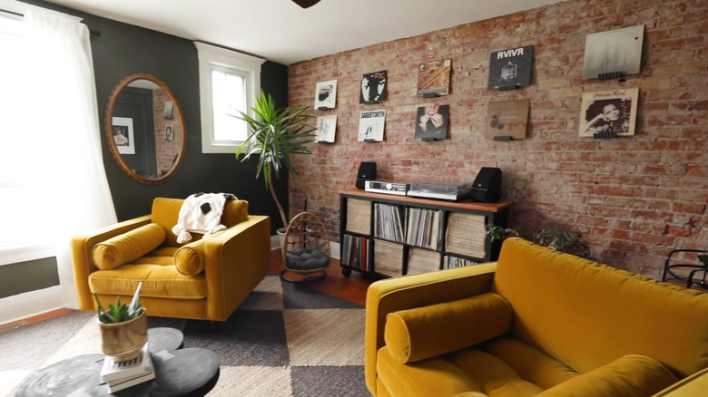
Black-and-white palettes are some of the most versatile because you can easily add lots of flair with a pop of color. Building a neutral base with black and white is easy and intuitive. From here, all you have to do is accent it with an eye-catching shade. Yellow is the perfect choice, as it will stand out beautifully against a backdrop of black and white. It will enliven the monochromatic feel, add energy, and inject a dash of excitement. If you're not sure what shade to choose, buttercup yellow, canary, ochre, and mustard are all good options. Brighter yellow tones, like buttercup, will stand out more and add an upbeat feel. Muted shades like mustard will feel less intense while still adding character and contrast.
Yellow also plays well with gray, so if you happen to have charcoal, slate, or dove gray mixed into your black-and-white décor scheme, you won't have to worry about any potential color clashes. There are endless ways you can effortlessly add yellow into a neutral palette, ranging from art on the wall to tableware, small ornaments, and soft furnishings. If you want to make a bold statement, you can also look at investing in a yellow accent chair or area rug. If this is too much of a commitment, consider smaller items, like a yellow footstool.
Lift brown by teaming it up with blue
Do you have a lot of dark brown wood in your space? Or maybe you're contemplating a moody, warm brown paint color? Dark woods are making a comeback, and warm neutrals are in. No longer is brown just a reminder of '70s rooms and décor. But designers are using brown a little differently than they did back then. Instead of washing it down with tangerine, yellow, and lime green, you can create balance and sophistication by partnering it with blue. Offsetting the warmth of brown shades with a backdrop of blue helps to inject freshness.
An easy way to implement this palette is by pairing brown wood furniture with blue wall paint. For a traditional look, blue-toned wallpaper with antique pieces can be a certified vibe. If you have dark wood flooring, pale blue walls can keep things airy and create visual contrast. Medium and dark blue shades will give a more moody feel and can help complement cherry wood cabinets and cool down red-toned hardwood floors.
Use yellow to up the energy of blue
Have you ever met someone who makes you feel like the most radiant version of yourself? Blue and yellow do this for each other. Like pink and green, they're situated across from each other on the color wheel. As opposites, they create a seamless synergy that's a beautiful balance between cool and warm. The sunny glow of yellow can make blue color schemes more inviting and dynamic. Blue can be a calming, peaceful color, and yellow is the perfect complement to this, adding a dash of cheerfulness into the mix.
There are almost unlimited ways you can let this combination play out in your space. From accenting an all-blue room with a few small bursts of yellow to going heavy on both hues, or using them both as accents. If you're into dopamine decorating, you can go for a canary yellow and cyan color combo. If you want a more toned-down, moody feel, look at the muted, darker options, like mustard and navy. Not sure what shades to pick? In the Navy by Sherwin Williams is a solid choice that will look very mature, especially if paired with a near-neutral yellow like Dirty Martini.